動畫
Prerequisites:
動畫預覽
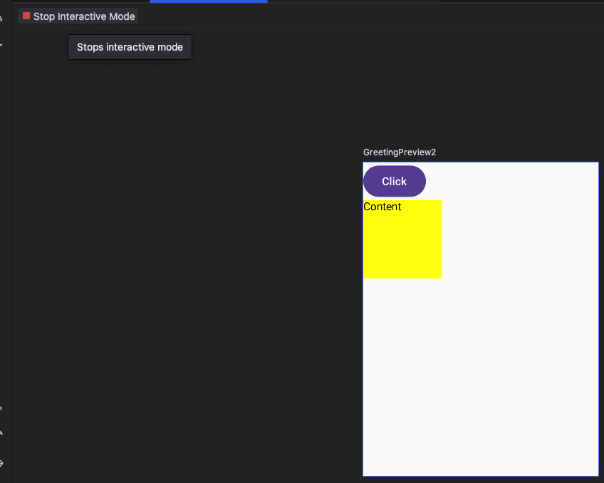
點選「Start Interactive Mode」開始動畫
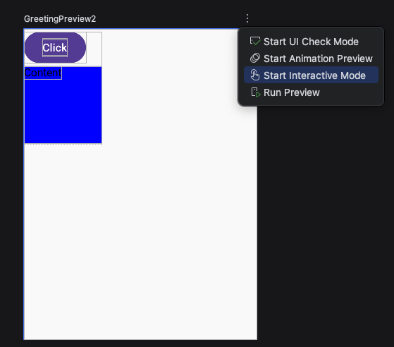
點選左上角紅色「Stop Interactive Mode」停止動畫
Animation Spec 動畫
Spring 彈簧
dampingRatio 彈簧彈性
愈小愈有彈性
Spring.DampingRatioHighBouncy     // 0.2f - 高彈性
Spring.DampingRatioMediumBouncy   // 0.5f - 中等彈性
Spring.DampingRatioLowBouncy      // 0.75f - 低彈性
Spring.DampingRatioNoBouncy       // 1.0f - 無彈性(臨界阻尼)
自訂彈性
1
2
3
4
val customSpring = spring<Float>(
    dampingRatio = 0.3f,  // 越小越有彈性
    stiffness = Spring.StiffnessMedium
)
stiffness 彈簧剛硬度
愈低愈柔軟,愈會回彈。
Spring.StiffnessHigh       // 10_000f - 高剛度(快速)
Spring.StiffnessMedium     // 1_500f  - 中等剛度
Spring.StiffnessLow        // 200f    - 低剛度(緩慢)
Spring.StiffnessVeryLow    // 50f     - 非常低
自訂回彈
1
2
3
4
5
// 自定義
val softSpring = spring<Float>(
    dampingRatio = Spring.DampingRatioMediumBouncy,
    stiffness = 100f  // 非常柔軟
)
animateContentSize + animationSpec(spirng)
1
2
3
4
5
6
7
8
9
10
11
12
13
14
15
16
17
18
19
20
21
22
23
24
25
26
27
28
29
30
31
32
33
34
@Preview(showBackground = true, widthDp = 300, heightDp = 400)
@Composable
fun GreetingPreview2() {
AnimateContentSizeExample1()
}
@Composable
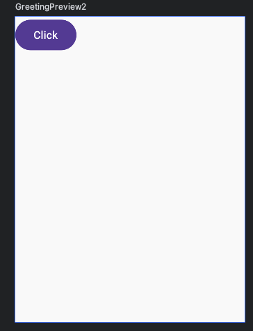
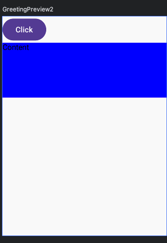
fun AnimateContentSizeExample1() {
var isExpanded by remember { mutableStateOf(false) }
Box(
modifier = Modifier
.fillMaxWidth()
.animateContentSize(
// 加上animationSpec
animationSpec = spring(
dampingRatio = Spring.DampingRatioHighBouncy,
stiffness = Spring.StiffnessLow
)
)
.background(Color.Blue)
.padding(16.dp)
.clickable {
isExpanded = !isExpanded
}
) {
Column {
Text("click")
if(isExpanded) {
Text("hello \n" +"world \n" +"hi \n",
modifier = Modifier.background(Color.White))
}
}
}
}
tween 動畫持續時間
durationMillis 動畫持續時間
語法
1
2
3
4
5
6
// 基本用法
val tweenSpec = tween<Float>(
    durationMillis = 300,      // 動畫持續時間(毫秒)
    delayMillis = 0,           // 延遲開始時間
    easing = LinearEasing      // 動畫速度
)
tween程式碼
1
2
3
4
5
6
7
8
9
10
11
12
13
14
15
16
17
18
19
20
21
22
23
24
25
26
@Composable
fun AnimateContentSizeExample() {
  var isExpanded by remember { mutableStateOf(false) }
  Box(
    modifier = Modifier
      .fillMaxWidth()
      .animateContentSize(
        // 展開動畫持續1秒
        animationSpec = tween(durationMillis = 1000)
      )
      .background(Color.Blue)
      .padding(16.dp)
      .clickable {
        isExpanded = !isExpanded
      }
  ) {
    Column {
      Text("click")
      if (isExpanded) {
        Text("hello \n" + "world \n" + "hi \n",
          modifier = Modifier.background(Color.White)
        )
      }
    }
  }
}
easing
進入畫面與離開畫面的動畫速度
- LinearEasing 線性(均速)
- FastOutSlowInEasing // 最常用的緩動
- FastOutLinearInEasing // 快速出,線性進
- LinearOutSlowInEasing // 線性出,慢速進
其它
// 彈性效果
CubicBezierEasing(0.68f, -0.55f, 0.265f, 1.55f)

// 回彈效果
EaseOutBounce
速度比較
easing = LinearEasing  // 線性:均速運動
// 0% ______ 50% ______ 100% (速度一樣)

easing = FastOutSlowInEasing  // 快速出,慢速入(最自然)
// 0% ████___ 50% ___██ 100% (開始快,結束慢)

easing = LinearOutSlowInEasing  // 線性出,慢速入
// 0% ______ 50% ___██ 100% (結束時減速)

easing = FastOutLinearInEasing  // 快速出,線性入
// 0% ████___ 50% ______ 100% (開始時加速)
animateXXXXAsState 狀態改變產生動畫
狀態變化時自動產生動畫效果。
| 函數 | 用途 | 返回值類型 | 常用場景 |
|---|---|---|---|
| animateDpAsState | 動畫化尺寸、間距 | Dp | 大小變化、位移 |
| animateFloatAsState | 動畫化小數值 | Float | 透明度、旋轉、縮放 |
| animateColorAsState | 動畫化顏色 | Color | 顏色過渡 |
animateDpAsState
- 尺寸、間距、位移等與 Dp 相關的值
語法
1
2
3
4
5
val animatedValue: Dp by animateDpAsState(
    targetValue: Dp,                    // 目標值
    animationSpec: AnimationSpec<Dp> = tween(),  // 動畫
    label: String = "DpAnimation"       // 除錯標籤
)
1
2
3
4
5
6
7
8
9
10
11
12
13
14
15
16
17
18
19
20
21
22
23
24
25
26
27
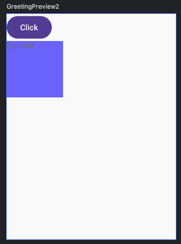
@Composable
fun AnimationDpStateExample() {
var isExpended by remember { mutableStateOf(false) }
val animateBoxHeight by animateDpAsState(
// 高度原本是0 按一下按鈕 變成100
targetValue = if (isExpended) 100.dp else 0.dp,
// 動畫
animationSpec = tween(2000),
label = "Height Animate"
)
Column {
Button(onClick = {
isExpended = !isExpended
}) {
Text("Click")
}
Box(
modifier = Modifier
.fillMaxWidth()
// 會自動轉換成dp
.height(animateBoxHeight)
.background(Color.Blue)
) {
Text("Content")
}
}
}
animateFloatAsState
animateFloatAsState 旋轉、透明度、縮小放大與 Float 相關的值。
1
2
3
4
5
6
7
8
9
10
11
12
13
14
15
16
17
18
19
20
21
22
23
24
25
26
27
28
29
30
31
32
33
34
35
36
37
38
39
40
41
42
43
44
45
@Composable
fun AnimationFloatStateExample() {
  var isExpended by remember { mutableStateOf(false) }
  val animateRotate by animateFloatAsState(
    targetValue = if (isExpended) 45f else 0f,
    animationSpec = tween(2000),
    label = "Rotate Animate"
  )
  val animateAlpha by animateFloatAsState(
    targetValue = if (isExpended) 1f else 0.5f,
    animationSpec = tween(2000),
    label = "Rotate Animate"
  )
  val animateScale by animateFloatAsState(
    targetValue = if (isExpended) 1.5f else 1.0f,
    animationSpec = tween(2000),
    label = "Scale Animate"
  )
  val animationYOffset by animateDpAsState(
    targetValue = if (isExpended) 60.dp else 0.dp,
    animationSpec = tween(2000),
    label = "Offset Animate"
  )
  Column {
    Button(onClick = {
      isExpended = !isExpended
    }) {
      Text("Click")
    }
    Box(
      modifier = Modifier
        .size(100.dp)
        .offset(y = animationYOffset)
        .graphicsLayer {
          rotationZ = animateRotate
          scaleX = animateScale
          scaleY = animateScale
          alpha = animateAlpha
        }
        .background(Color.Blue)
    ) {
      Text("Content")
    }
  }
}
animateColorAsState
- 顏色變化、漸變色轉換
1
2
3
4
5
6
7
8
9
10
11
12
13
14
15
16
17
18
19
20
21
22
23
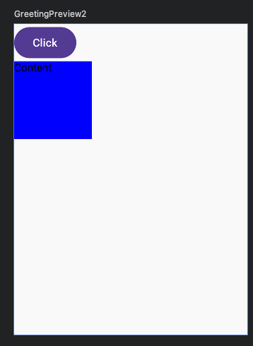
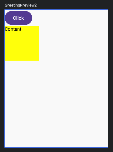
@Composable
fun AnimationColorStateExample() {
var isExpended by remember { mutableStateOf(false) }
val animateBgColor by animateColorAsState(
targetValue = if (isExpended) Color.Yellow else Color.Blue,
animationSpec = tween(2000),
label = "Color Animate"
)
Column {
Button(onClick = {
isExpended = !isExpended
}) {
Text("Click")
}
Box(
modifier = Modifier
.size(100.dp)
.background(animateBgColor)
) {
Text("Content")
}
}
}
AnimatedVisibility 顯示與消失動畫
官方文件有許多進入動畫與離開動畫的展示效果。
語法
1
2
3
4
5
6
7
8
9
10
11
12
13
// 顯示或隱藏
var isVisible by remember { mutableStateOf(false) }
AnimatedVisibility(
  // 顯示或隱藏
  visible = isVisible,
  // 進入動畫
  enter = fadeIn(),
  // 離開動畫
  exit = fadeOut()
) {
	// 要顯示與隱藏的東西
	// 要顯示與隱藏的東西
}
完整程式碼
1
2
3
4
5
6
7
8
9
10
11
12
13
14
15
16
17
18
19
20
21
22
23
24
@Composable
fun AnimatedVisibilityExample() {
  var isVisible by remember { mutableStateOf(false) }
  Column {
    Button(onClick = {
      isVisible = !isVisible
    }) {
      Text("Click")
    }
    AnimatedVisibility(
      visible = isVisible,
      enter = fadeIn(),
      exit = fadeOut()
    ) {
      Box(
        modifier = Modifier
          .size(100.dp)
          .background(Color.Blue)
      ) {
        Text("Content")
      }
    }
  }
}