System UI
螢幕畫面
┌─────────────────────────────────┐
│ Top    (Status Bar)             │
├─────────────────────────────────┤
│                                 │
│                                 │
│          你的内容                │
│                                 │
│                                 │
├─────────────────────────────────┤
│ Bottom (Navigation Bar)         │
└─────────────────────────────────┘
- Status Bar 頂部System UI
- Navigation Bar 底部System UI
- System Bar 頂部System UI + 底部System UI
- ime 輸入的文字框
Status Bar
以下測試不能使用@Preview,會看不出來效果,要用模擬機測試。
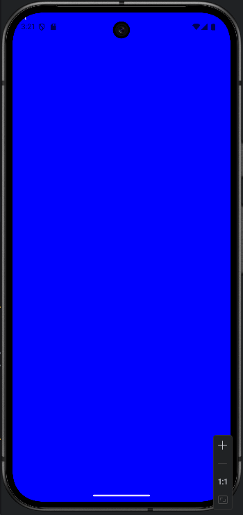
沒有加Status Bar之前:
1
2
3
4
5
6
7
8
9
10
11
12
13
14
15
16
17
18
19
20
21
22
23
24
25
26
import androidx.compose.foundation.layout.WindowInsets
import androidx.compose.foundation.layout.asPaddingValues
import androidx.compose.foundation.layout.fillMaxSize
import androidx.compose.foundation.layout.statusBars

class MainActivity : ComponentActivity() {
  override fun onCreate(savedInstanceState: Bundle?) {
    super.onCreate(savedInstanceState)
    enableEdgeToEdge()
    setContent {
      testStatus()
    }
  }
}

@Composable
fun testStatus() {
  Box(
    modifier = Modifier
      .fillMaxSize()
      //.padding(WindowInsets.statusBars.asPaddingValues())
      .background(Color.Blue)
  ) {
    Text("Test", color = Color.White)
  }
}
WindowInsets.statusBars().asPaddingValues()
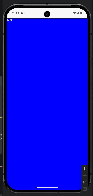
加Status Bar之後:
1
2
3
4
5
6
7
8
9
10
11
@Composable
fun testStatus() {
  Box(
    modifier = Modifier
      .fillMaxSize()
      .padding(WindowInsets.statusBars.asPaddingValues())
      .background(Color.Blue)
  ) {
    Text("Test", color = Color.White)
  }
}
statusBarsPadding()
效果與前一個程式碼相同。
1
2
3
4
5
6
7
8
9
10
11
@Composable
fun testStatus() {
  Box(
    modifier = Modifier
      .fillMaxSize()
      .statusBarsPadding()
      .background(Color.Blue)
  ) {
    Text("Test", color = Color.White)
  }
}
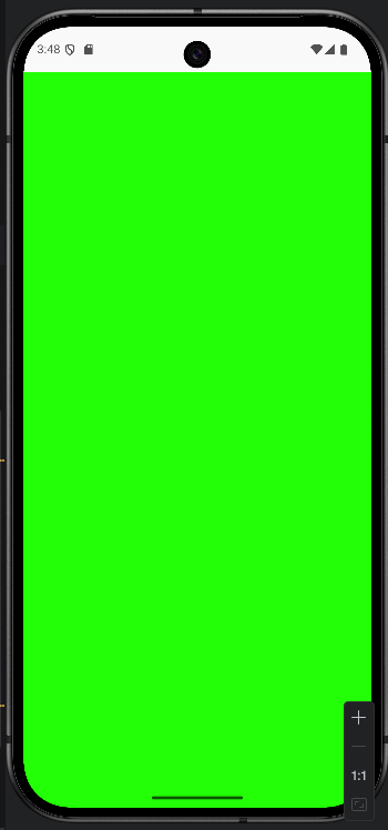
systemBarsPadding() vs statusBarsPadding()
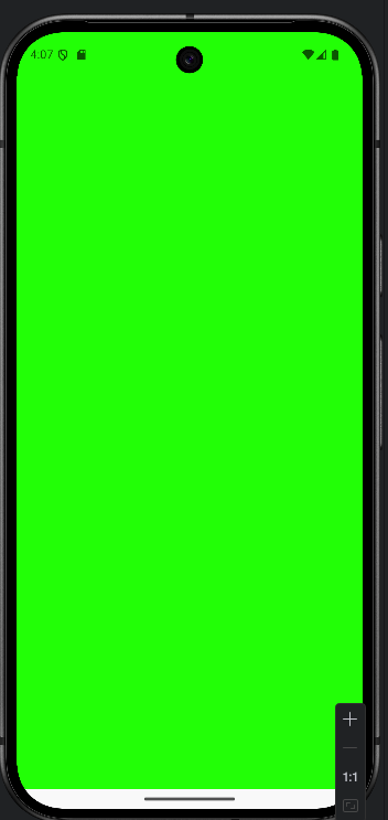
Status Bar,只會增加頂部 System UI空間。
System Bar,會增加頂部System UI空間,與底部System UI空間。
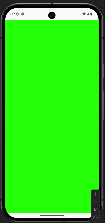
Status Bar只有螢幕上方有增加空間。
1
2
3
4
5
6
7
8
9
10
11
12
13
@Composable
fun testStatus() {
  Box(
    modifier = Modifier
      .fillMaxWidth()
      .statusBarsPadding()
  ) {
    Box(modifier = Modifier
      .fillMaxSize()
      .background(Color.Green)
    )
  }
}
System Bar是上方與下方都有增加空間。
1
2
3
4
5
6
7
8
9
10
11
12
13
@Composable
fun testStatus() {
  Box(
    modifier = Modifier
      .fillMaxWidth()
      .systemBarsPadding()
  ) {
    Box(modifier = Modifier
      .fillMaxSize()
      .background(Color.Green)
    )
  }
}
Navigation Bar
底部System UI
以下程式碼,只會在底部增加空間。
1
2
3
4
5
6
7
8
9
10
11
12
13
@Composable
fun testStatus() {
  Box(
    modifier = Modifier
      .fillMaxWidth()
      .padding(WindowInsets.navigationBars.asPaddingValues())
  ) {
    Box(modifier = Modifier
      .fillMaxSize()
      .background(Color.Green)
    )
  }
}
imePadding()
Prerequisites:
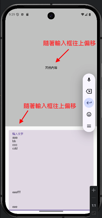
隨著輸入框變大,imePadding()也會跟著變大。

1
2
3
4
5
6
7
8
9
10
11
12
13
14
15
16
17
18
19
20
21
22
23
24
25
26
27
28
29
30
31
32
@Composable
fun WithIMEPadding() {
  Column(
    modifier = Modifier
      .fillMaxSize()
      .imePadding()  // 關鍵在這行!
  ) {
    // 上方內容
    Box(
      modifier = Modifier
        .weight(1f)
        .fillMaxWidth()
        .background(Color.LightGray)
    ) {
      Text("其他內容", modifier = Modifier.align(Alignment.Center))
    }

    var text by remember { mutableStateOf("") }

    // 2. 將狀態傳遞給 TextField
    TextField(
      value = text,  // 使用狀態值
      onValueChange = { newText ->
        text = newText  // 更新狀態
      },
      label = { Text("輸入文字") },
      modifier = Modifier
        .fillMaxWidth()
        .padding(16.dp)
    )
  }
}
以下是舊的文章
為什麼system bar會變白色
原因是因為在MainActivity的Surface使用到MaterialTheme的 background預設是白色
1
2
3
4
5
6
7
8
9
10
11
12
//使用這個會讓buttonNavigation被遮住
WindowCompat.setDecorFitsSystemWindows(window,false)
  setContent {
    Project1Theme {
      Surface(
        modifier = Modifier.fillMaxSize(),
        color = MaterialTheme.colors.background
      ) {
        NavHostApp()
      }
    }
  }
MainActivity修改成
1
2
3
4
5
6
7
8
9
10
11
12
13
import androidx.compose.material.MaterialTheme
import androidx.compose.material.Surface
WindowCompat.setDecorFitsSystemWindows(window,false)
  setContent {
    Project1Theme {
      Surface(
        modifier = Modifier.fillMaxSize(),
        color = MaterialTheme.colors.primary
      ) {
        NavHostApp()
      }
    }
  }
Article詳細頁修改成使用系統的TopAppBar
1
2
3
4
5
6
7
8
9
10
11
12
13
14
15
16
17
18
19
20
21
22
package com.example.project1.ui.screens
import androidx.compose.foundation.layout.statusBarsPadding
import androidx.compose.material.Scaffold
import androidx.compose.material.Text
import androidx.compose.material.TopAppBar
import androidx.compose.runtime.Composable
import androidx.compose.ui.Modifier
@Composable
fun ArticleDetailScreen() {
  Scaffold(
    topBar = {
	  //系統的TopAppBar
      TopAppBar(
        title = { Text(text = "Detail") }
      )
    },
	//system status bar的高度
    modifier = Modifier.statusBarsPadding()
  ) {
    Text(text = "文章詳情")
  }
}
法二
MainActivity 仍可使用預設白色
1
2
3
4
5
6
7
8
9
10
11
12
//使用這個會讓buttonNavigation被遮住
WindowCompat.setDecorFitsSystemWindows(window,false)
  setContent {
    Project1Theme {
      Surface(
        modifier = Modifier.fillMaxSize(),
        color = MaterialTheme.colors.background
      ) {
        NavHostApp()
      }
    }
  }
直接在Scaffold中的modifier寫入background,記得順序要在statusBarPadding()前面
1
2
3
4
5
6
7
8
9
10
11
12
13
14
15
16
17
18
19
20
21
22
23
24
package com.example.project1.ui.screens
import androidx.compose.foundation.background
import androidx.compose.foundation.layout.statusBarsPadding
import androidx.compose.material.MaterialTheme
import androidx.compose.material.Scaffold
import androidx.compose.material.Text
import androidx.compose.material.TopAppBar
import androidx.compose.runtime.Composable
import androidx.compose.ui.Modifier
@Composable
fun ArticleDetailScreen() {
  Scaffold(
    topBar = {
      TopAppBar(
        title = { Text(text = "Detail") },
      )
    },
    modifier = Modifier
      .background(MaterialTheme.colors.primary)
      .statusBarsPadding()
  ) {
    Text(text = "文章詳情")
  }
}