TextField
簡單TextField程式碼:
1
2
3
4
5
6
7
8
9
10
11
12
13
14
15
16
17
18
19
20
21
class MainPage extends StatelessWidget {
  const MainPage({Key? key}) : super(key: key);
  @override
  Widget build(BuildContext context) {
    return MaterialApp(
        home: Scaffold(
      body: Container(
          height: double.infinity,
          width: double.infinity,
          color: Colors.yellow,
          child: Column(
            children: [
              TextField(),
              TextField(),
              TextField(),
              TextButton(onPressed: () {}, child: Text("送出"))
            ],
          )),
    ));
  }
}
InputDecoration 輸入框樣式
語法
TextField(decoration: InputDecoration())
InputDecoration 屬性說明
| 屬性 | 類別 | 說明 |
|---|---|---|
| contentPadding | EdgeInsets | 內部間距 |
| hintText | String | 提示文字 |
| fillColor | Colors | 顏色 |
| border | OutlineInputBorder | 輸入框邊框 |
OutlineInputBorder 屬性說明
| 屬性 | 類別 | 說明 |
|---|---|---|
| borderSide | BorderSide | none為無邊框 |
| borderRadius | BorderRadius | 輸入框圓角 |
1
2
3
4
5
6
7
8
9
10
11
12
13
14
15
16
17
18
19
20
21
22
23
24
25
26
27
28
29
30
31
32
33
34
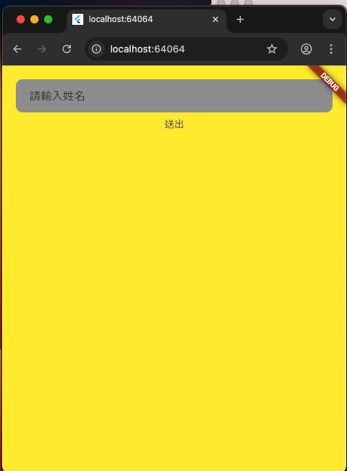
import 'package:flutter/material.dart';
void main() {
runApp(MainPage());
}
class MainPage extends StatelessWidget {
const MainPage({Key? key}) : super(key: key);
@override
Widget build(BuildContext context) {
return MaterialApp(
home: Scaffold(
body: Container(
padding: EdgeInsets.all(20.0),
height: double.infinity,
width: double.infinity,
color: Colors.yellow,
child: Column(
children: [
TextField(
decoration: InputDecoration(
contentPadding: EdgeInsets.only(left: 20.0, right: 10),
hintText: "請輸入姓名",
fillColor: Colors.grey,
filled: true,
border: OutlineInputBorder(
borderSide: BorderSide.none,
borderRadius: BorderRadius.circular(10.0)))),
TextButton(onPressed: () {}, child: Text("送出"))
],
)),
));
}
}